Why Polymer Clay Color Inspirations Made Me Cry
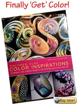
I own Polymer Clay Color Inspirations not because it contains color wheels, charts, palettes, mixing recipes, blending tips, and color combinations, but because it made me cry.
Let me explain...
When I was working on color samples for ColorMixr™, there was a point where I had spent days trying to create accurate polymer clay mixing recipes for ochre and other intermediate hues and I was just getting dark browns.
As a last resort I opened Polymer Clay Color Inspirations and, no surprise, found a worksheet (p.72) and a confirmation of the insane amounts of yellow needed for those colors (p.73) that led me to the correct equations.
At That Point I Did Cry...
Yeah, I know that sounds silly, but I was extremely tired. And I was so relieved to find the answer to my color problems. Failure to find accurate formulas for those colors was a problem that would have caused me to have to abandon a project that had cost thousands of dollars and years of my time.
This book was one that I had frequently borrowed from the San Diego Polymer Clay Guild library — my budget is extremely limited (app development costs are a killer!). But I went online and bought it right then! I'd finally figured out that I couldn't live without it.
Now you’re not likely to be blending 2,200+ polymer color samples any time soon. But you will face muddy color combinations dulling your jewelry, canes that fade to gray when reduced and color composition problems that drive you crazy. You can find the mental tools to fix those color palette problems in Lindly and Maggie's magnum opus.
What I Like Best About Polymer Clay Color Inspirations
The book is divided up into ten chapters plus an extensive collection of worksheets, diagrams, resources and hundreds of photos from outstanding artists which beautifully illustrate the authors’ points.
Here’s what I’ve found most useful in each chapter:
Chapter 1) "Polymer Clay Color Basics: A Primer" — How to accurately measure different brands of clay. To which I’d like to add my own variation, the grid method, which is most useful when you have to mix a recipe with a very large proportion of one color relative to the others. It’s much easier than stamping out hundreds of bits with a cookie cutter and is recommended to prevent hand cramping.
Chapter 2) "Understanding the Three Properties of Color" — Defining hue, value and saturation. The chart which illustrates where the main pure colors fall along the light to dark spectrum is especially useful for making your canes pop even when they’ve been reduced to their tiniest.
 Pic Collage App
Chapter 3) "Finding Your Inspirational Colors" — How to sort and organize those paper clippings that you’ve collected to find what your color palette preferences are.
Or you could do what I did and take photos of them all and use a collaging app to assemble them. It takes up a lot less space. And you can work on your colors anywhere. I recommend PicCollage for both Android and Apple. There’s many collage apps out there, but this one allows you to clip irregular shapes out of your clipping photos for a more unified, organic composition.
Chapter 4) "Choosing Your Colors for a Project Palette" — So much more than a bunch of color wheels. How to use metallic, fluorescent, muds and prepackaged colors to get the lighter, darker or special effect colors you want in your projects or jewelry.
Chapter 5) "Mixing Colors that Flow" — Mixing color ‘scales’. Like musical scales, but going from dark to light instead of ‘doh’, ‘ray’ ‘me’...

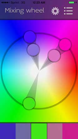
Chapter 6) "Orchestrating Color Combinations" — Controlling contrast in your color compositions. Value contrasts are especially important with canes that will be reduced. There’s also a good explanation of six different types of hue contrasts. This section is a great companion for when you’re using the ColorMixr™ Mixing wheel.
Chapter 7) "Playing Games with Color" — This chapter is full of color special effects. It has examples of how to create shifty, sneaky colors, afterimages and optically shifting polymer clay color combinations that fool your eyes.
Chapter 8) "Exploring Color Composition: Placement and Proportion" — Maggie and Lindly suggest starting points to determine how much of which color you should use in the design of your necklaces, bracelets, broaches and or other polymer artwork. Extremely useful.
Chapter 9) "Exploring Pattern and Texture in Your Colors" — Three of my favorite exercises in the entire book. Their suggestion to make lots of small pattern samples will help keep you from feeling overwhelmed.
Chapter 10) "Putting it all together" - creating your own color sample box that incorporates all that you’ve learned in the previous chapters. But most importantly for me, it has a list of 4 things you can do to change your compositions if you almost happy with them. But I’m not going to tell you here. The list is on page 130, you’ll have to check it out for yourself after you’ve bought your own copy of Polymer Clay Color Inspirations.
|
|
|
What Else About Polymer Clay Color Inspirations Do People Need to Know?
Polymer Clayer Home › Books! › Polymer Clay Color Inspirations


